Behind The Design Of Our Cover Star Living Room
Integrate styles and eras using our room in House Beautiful’s show home as a guide.
When House Beautiful petitioned us to transform the massive living room for their Buckhead-area showhouse, we were thrilled by its openness, central location in the house, and the light that flooded in through its many windows. We were also aware of the challenges the room posed.
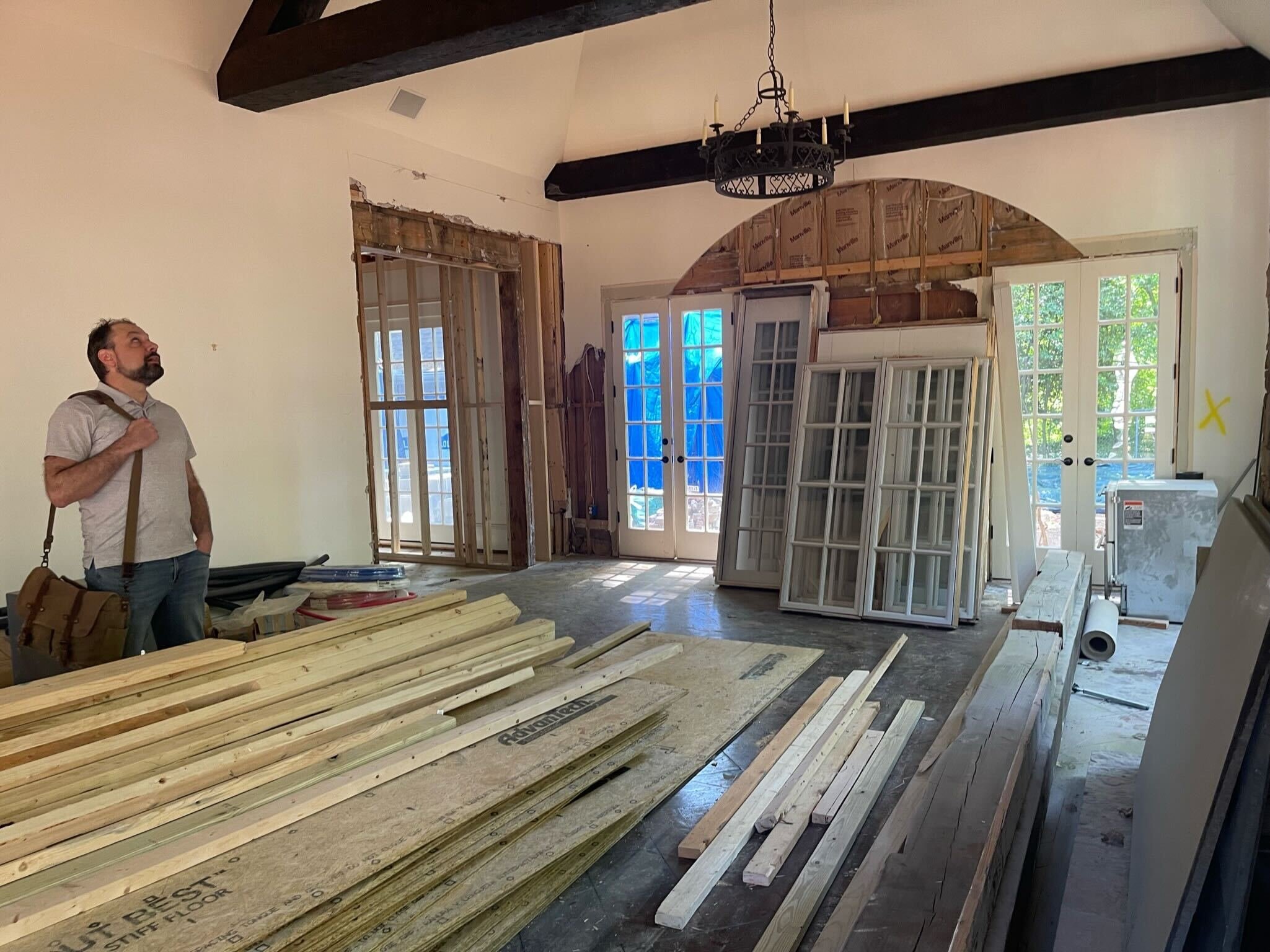
The living room in this 1950s Chastain Park Tudor was grand in an early-2000s, Sopranos sort of way. Think dark beams overhead, a gray stone fireplace, and tired beige walls that all begged to be made lighter and brighter, but with all the gravitas befitting a historic Atlanta home.
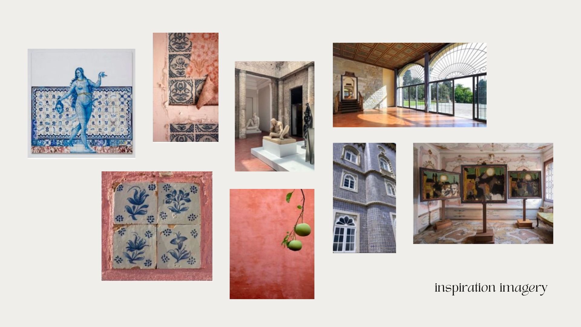
Sans client, we decided to channel a conservatory-like room in a storied European villa, where a modern family would happily hang out. To evoke the feeling of a combination living room, garden room, and sunroom, the space also needed to interact with the outdoors.
“We wanted to tell a story about the room and who we imagine living there. Layers of objects and books feel curated and speak to a curiosity for different cultures and artistic movements.”
first, the floor plan
You can find a room’s focal point by determining how you want to use the space. In this case, we wanted to encourage gathering and talking, so we left a TV out of the equation and planned a comfortable, laid-back seating area in the heart of the room. With such an expansive room, we also wanted to make the margins functional, with lots of smaller vignette moments.
Second, the architectural elements
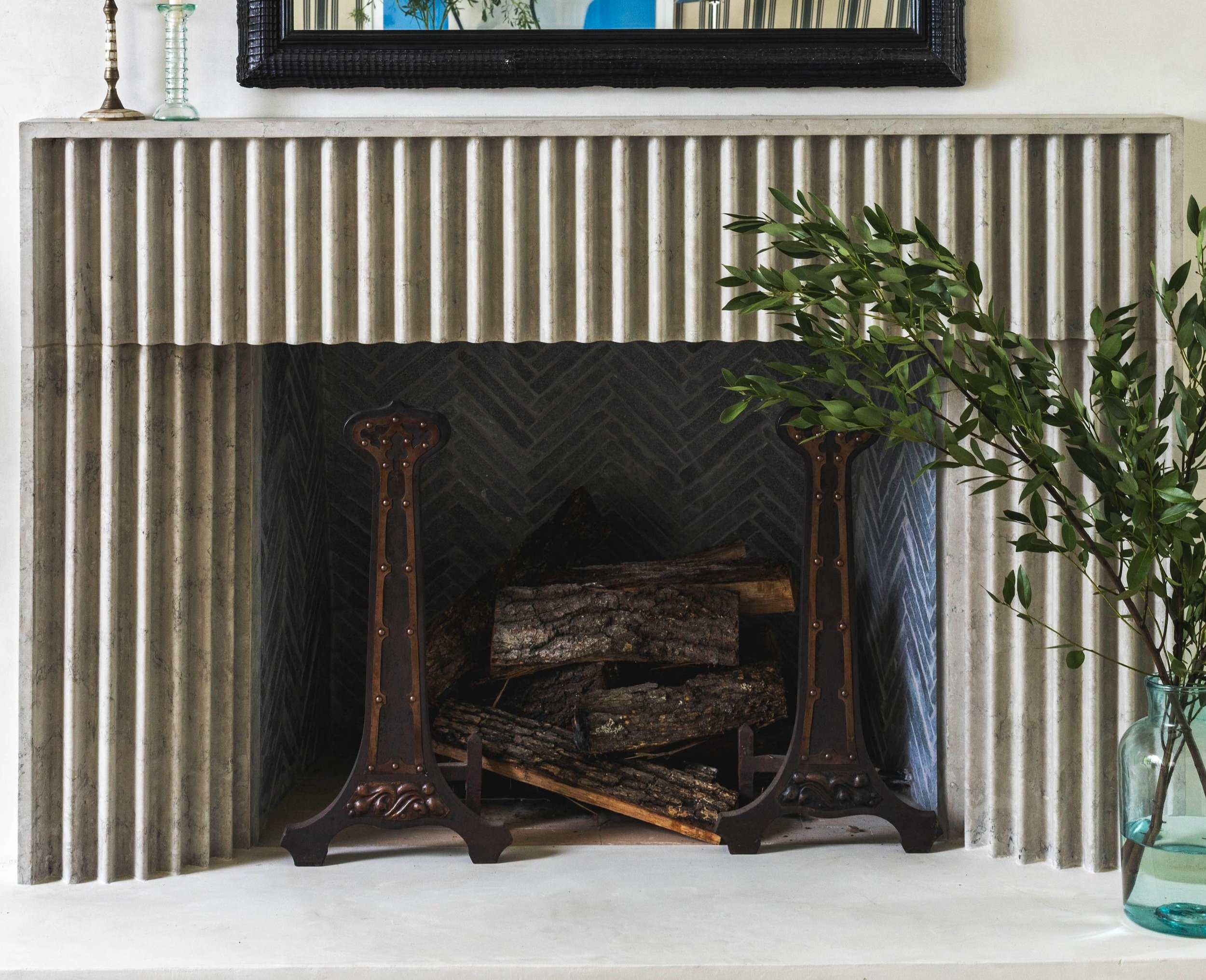
We replaced traditional, energy inefficient windows with Pella steel-cased windows and doors, with the show-stopping arched picture window adding particular impact. Frames were painted Farrow and Ball’s Green Blue to create more interplay with the leafy vistas outside. The beams and walls were coated in warm white—goodbye, Gothic! A modern version of a stone fireplace, featuring fluted details inspired by Corinthian columns and a plaster chimney, adds a moment of unexpected visual interest.
Next, we decorate
Floors & Walls
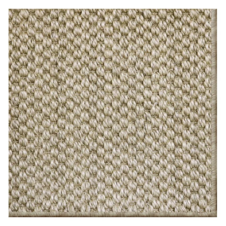
Sisal is the perfect choice for a pass-through room. Besides being functional, it feels at home in a sunroom-type space. It also allows the foundation to feel textural without introducing a pattern.
While the variegated striped wallpaper from Farrow & Ball leans traditional compared to the modern fireplace, the linearity of the fireplace fluting assimilates the two features and ultimately engages the vaulted ceiling, giving a sense of coziness. We consigned the wallpaper to all but the far wall with the arched window and the back of the built-in sofa nook to let those architectural forms take center stage, and used plaster around the fireplace to create a warm backdrop for the beautiful fluting details.
A textural choice great for high-traffic areas. Fibreworks, siskiyou collection, Classic Sisal
Plays well with the outdoors when used on window trim. Farrow & Ball, Green Blue
black and white stripes act as an unexpected backdrop for bold art. Farrow & Ball, tented stripe, 1388
Lighting
To lean into the historic ambience of the room, we installed zinc lanterns from Circa Lighting. We used four pendants as the room was large enough to accommodate them, which helped create coziness in the vast space. Two candle-like sconces placed on either side of the Alex Katz piece create the feeling of a bookended vignette. Accent lighting is a great way to break up a classic space with modern forms, like we did by placing this chrome lamp, also from Circa Lighting, amongst vintage gems.
A lantern pendant evokes visions of a historic villa. Circa Lighting, Elsinore Hanging Lantern
Simple sconces create a warm yet sophisticated ambience. Circa Lighting, Belfair Large Double Sconce
a modern lamp amongst antiques keeps a space from feeling thematic. Circa lighting, Orsay Medium Table Lamp
Furniture
Throwing a linen slipcover over a sofa with a classic shape has an informality that we wanted to play with. Few things have more conservatory vibes than a cane daybed (it feels like outdoor furniture used indoors), but upholstering the cushion in a dynamic Sanderson fabric ensured it felt like it belonged inside. The built-in sofa helps the large room feel slightly smaller, while William Morris fabric and bullion fringe makes it a statement. Old-world vintage pieces are balanced with flashes of chrome in the coffee table and a sleek poppy-red bench.
A linen slipcover gives laid-back Montecito vibes. Lee Industries, Slipcovered Sofa
Art
Pieces from different eras coexist in harmony, like the Alex Katz lithograph above the vintage console and Chagall-esque piece in the seating nook. We like the tension between a piece that looks newly purchased and something that could have been inherited (or just came with the villa). The black and white striped backdrop allowed color to be brought in through the art.
Hear Zoe chat about the space over on House Beautiful!
Photography by Rustic White Interiors


