
Brownie Points
we’ll let you take the credit for a perfectly executed brown paint moment

Stacy Zarin Goldberg
From coffee to chai, brown’s rich and earthy tones are just as delicious in the home as they are in your mug. With so many different shades, saturations, and undertones, it’s as versatile as black with a slightly softer impact. Done correctly, brown won’t read dingy or comically retro, but can bring comfort and sophistication to a space.
Below, a roundup of our current favorites and how to put them to work.
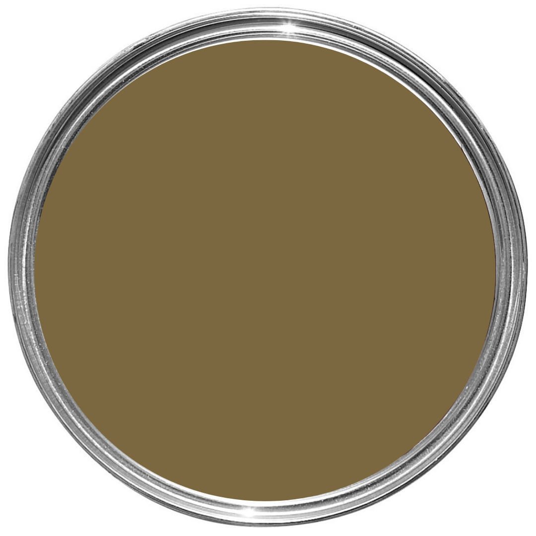
1. Salon Drab BY FARROW & BALL
What it is: A rich, dimensional green-brown.

How to use it: Kids, pets, and other mess-happy occupants don’t stand a chance against this olive-y chocolate brown. High-traffic areas are made instantly chic when this forgiving shade is employed large-scale. Case in point: This family kitchen we completed with heavy-duty use in mind.

Stacy Zarin Goldberg
2. Masterpiece Theater by Backdrop
What it is: An olive-brown with a hint of yellow.
How to use it: Like the name implies, this shade has a regal feel that brings the drama. Consider leaning into the theatrics by coating walls, trim, and ceiling in this impactful shade. A piece of accent furniture in a poppy red would provide a delightful, unexpected freshness.
3. Dirty Chai by Clare
What it is: A versatile gray-brown shade that’s both warm and chalky.
How to use it: This shape-shifting color has a presence without being too heavy. We envision using it to showcase millwork and built-ins and cozy up a space. Non-boring neutral? Yes, please.


4. Ganache by Little Greene
What it is: A decadent, true brown that’s deep and velvety.
How to use it: Modeled after a brown discovered on the walls of an 1800s estate, this classic brown evokes a sense of luxury. Make an impact by pairing Ganache with an even darker red-toned brown, or let it ground a lighter space by using it on a large cased good.
5. Dead Salmon by farrow & ball

Stacy Zarin Goldberg
What it is: An earthy, mushroom brown with pink undertones.

How to use it: Don’t be fooled by the name—this pinky neutral is like the paint version of candlelight. Soft, flattering, and universal in its appeal, Dead Salmon has a romantic quality that is neither feminine not masculine. In this project, we continued the shade from the dining room trim into the butler’s pantry lower cabinets to create a thread between the two wallpapered spaces.

6. Treasure by Portola Paints
What it is: A dark, textured limewash.
How to use it: The easiest way to be transported to a sexy, Mediterranean villa? This finish from Portola. While deeply saturated, the movement and texture in this shade is clear, revealing a complexity that makes a room feel like it’s been there for ages. Spaces that lack architectural interest would greatly benefit from the soul added by this bronze-toned brown.
7. Gaucho Brown by Benjamin Moore
What it is: A mid-tone tan with a pink base.
How to use it: The warm undertones in Gaucho Brown prevent it from veering into boring beige territory. Natural light brings out the pinks in this shade, creating a sweet, snug vibe that would work wonderfully in a nursery.

8. Cola by farrow & ball
What it is: A red-brown saturated enough to almost feel like a jewel tone.

How to use it: While Cola is a punchy brown, it still feels neutral enough to use large-scale. We used the shade on the cabinets in our Washington, D.C., office lounge, and it gives a cozy, cocooned feeling that holds its own amongst other materials. We originally painted them a super-pale blue, but wanted more depth. As soon as they were changed, we knew we had made the right decision.

Stacy Zarin Goldberg
BOOKMARK THIS:
Test a minimum of three and a maximum of five—don’t settle, but don’t get overwhelmed. Samplize is a mess-free way to try multiple samples.
Choose your sample based on type preference (pots, dry, peel and stick) and what will allow you to best envision the color in your space.
Always put the samples up in different areas of the room and observe over a 24-hour period. Different times of day will reveal different paint qualities.
Consider the most common type of weather and light sources that create the room’s atmosphere and let it guide your paint choice. For example, if you live in a mostly sunny part of the world, don’t test paints on the one rainy day of the month.
Test our tips and send us your photos! We might just give you a shout-out on Instagram.