
Layer Patterns Like A Pro
Florals and leopard and stripes, oh my!

Pattern mixing can be a tricky science. How do you layer prints in a way that’s not dizzying? Should you stay in the same color families? Is there a fool-proof formula for getting it right? While we tend to stay away from hard and fast rules, there are certainly some helpful guidelines for creating a space full of pattern that doesn’t venture into wacky territory. Let’s use our maximalist client’s first floor to demonstrate.
get inspired and order samples (and more samples)
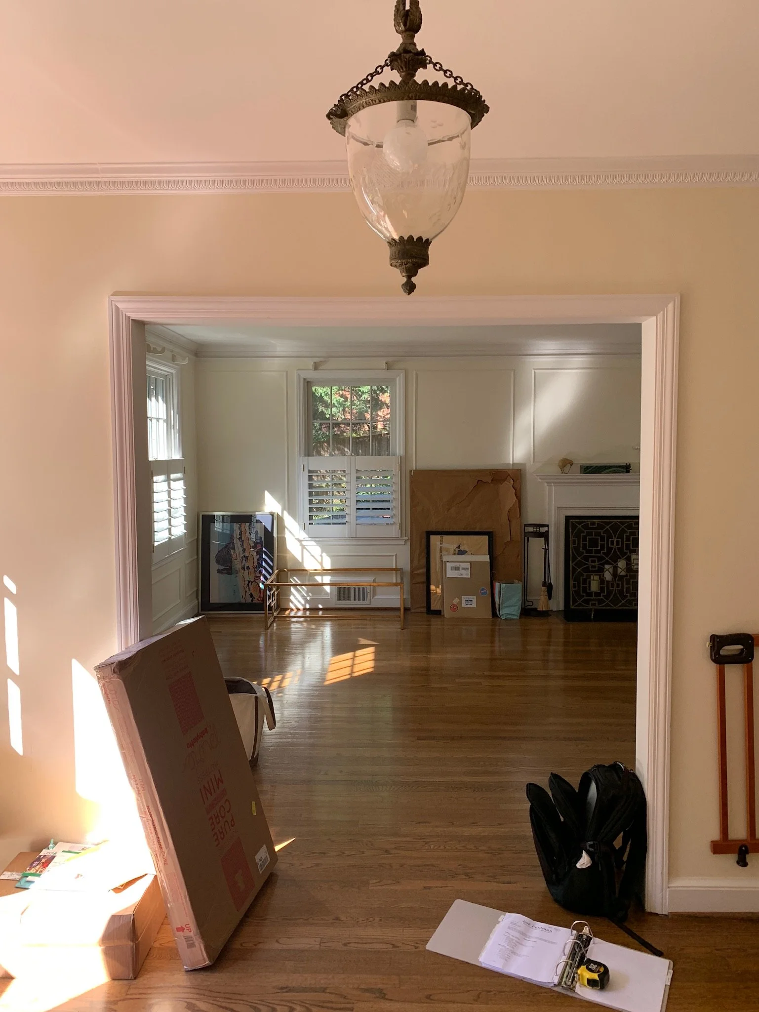
Prior to our overhaul, the dining room was coated in a yellow-based white paint and generally looked like a sad white box. The foyer, painted in the same shade, wasn’t helping—not at all in line with our fashion-forward, bold clients. With subjects who were unafraid of color and pattern and partial to British style, we had room to experiment. We ordered plenty of fabric, wallpaper, and finish samples and went through many iterations of this scheme before we hit the right balance (more on that later).

consider all finishes
Wallcoverings and paint:
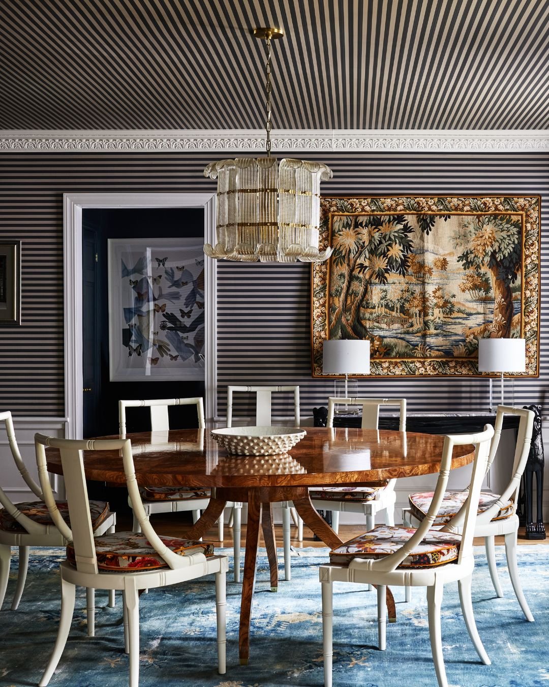
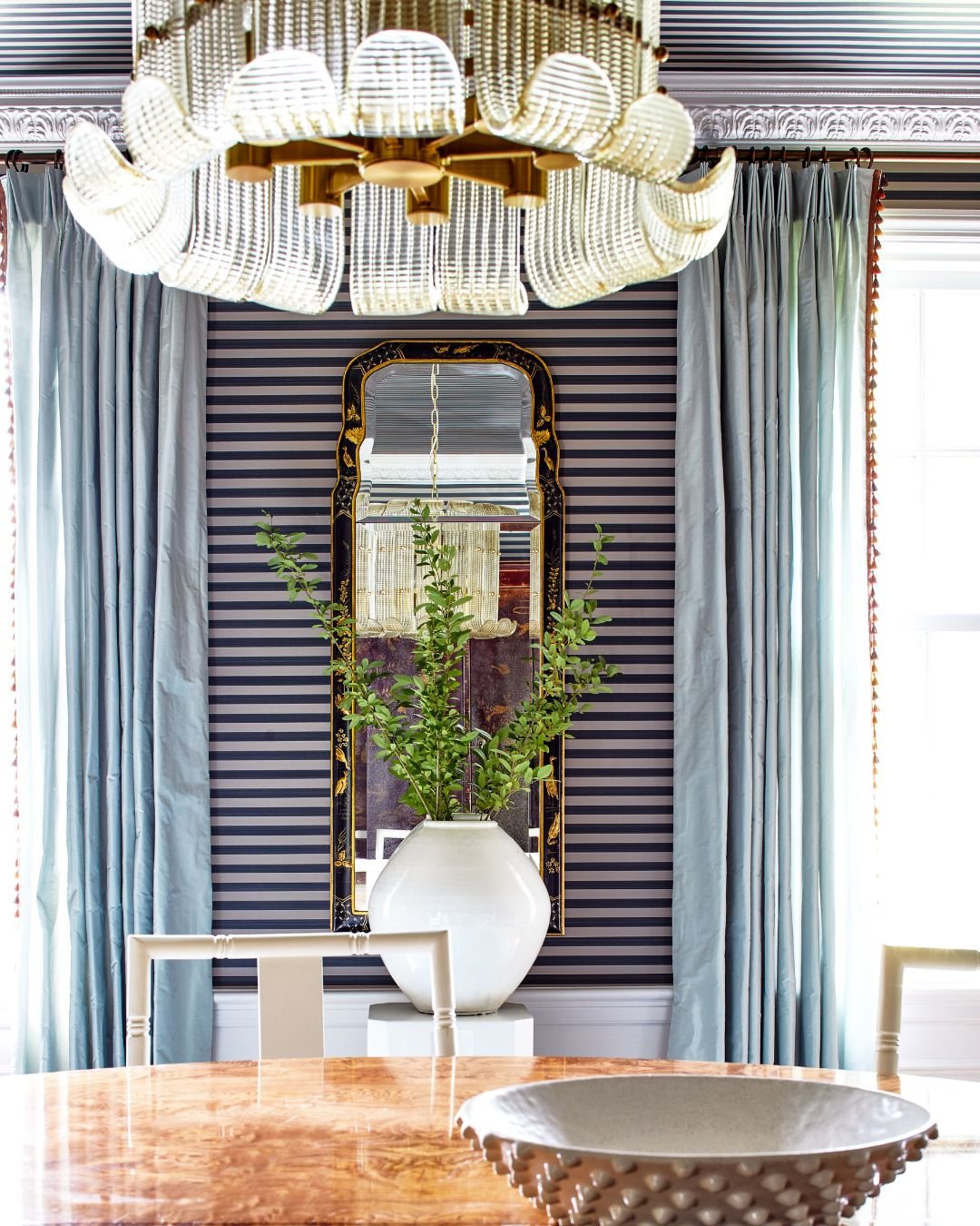
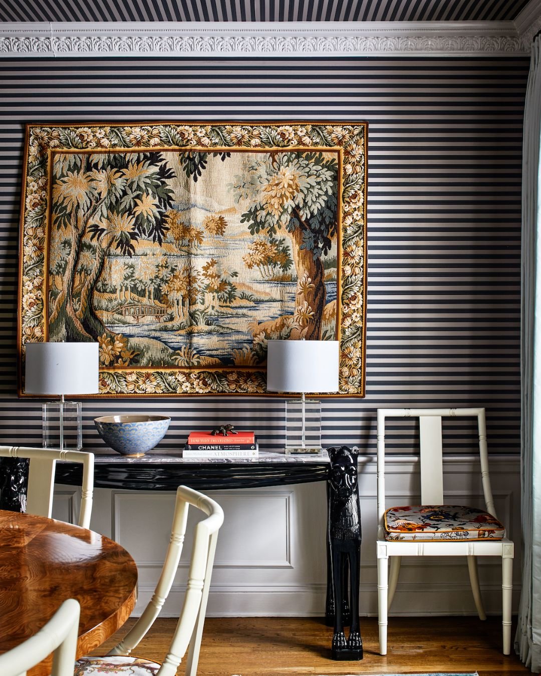
We contemplated vistas from every angle when choosing wall treatments. The formal dining room got a buttoned-up feel with a striped wallpaper from Farrow & Ball, while continuing the stripes in the opposite direction on the ceiling felt unexpected and broke up the pattern, preventing the room from feeling like an optical illusion. In the entry, the clients initially pushed for a geometric print on the walls, but we ultimately convinced them not to compete with the linearity of the stripes. A nature-inspired floral paper by Morris & Co. balances the look. A glossy chartreuse in the living room replaced pattern with texture and held its own without overpowering the scheme.
Furniture:
A classic burlwood dining table grounded the space with its soft, natural pattern. Formal Regency-style dining chairs elevated the room, while bold floral seat cushions felt playfully unexpected and complemented the uniformity of the striped walls. Biedermeier occasional chairs with seats upholstered in black leather also root the space in classicism.

Accessories:
Don’t let final touches be an afterthought. A vintage landscape tapestry felt at home in a formal room, and its texture added depth and provided relief from the striped wallpaper. The shape of the Murano glass chandelier mirrored the lines of the wallpaper, while its reflectiveness gave dimension without competing with the other finishes.
To check out the full project, CLICK HERE.
Sourcebook:

A bold floral tempers formal dining chairs. House of Hackney fabric

A burlwood finish in a classic shape. Round Mid Century Burlwood Dining Table

A sleek sconce turns fun with a starburst accent. Visual Comfort Etoile Sconce
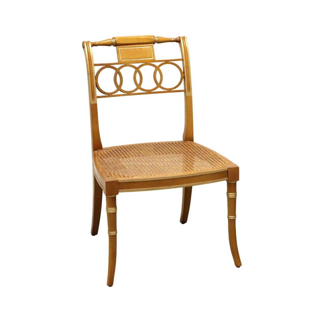
Regency chairs exude timeless elegance. Historic Regency Dining Chairs, Chairish

Vertical stripes add height to walls. Farrow & Ball Closet Stripe Wallpaper

Florals juxtapose delightfully with geometric patterns. Morris & Co Wallpaper
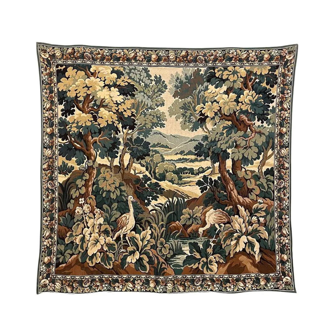
Statement art to attract eyes and drop jaws. Vintage Flemish Landscape Tapestry, Chairish

Murano glass gives major Italian vibes. Hudson Valley Lighting Group Chandelier
Photography: Stacy Zarin Goldberg